Android杂食店-一次MpAndroidChart美化过程

半年更系列回来了

MpAndroidChart的真好用

效果比较

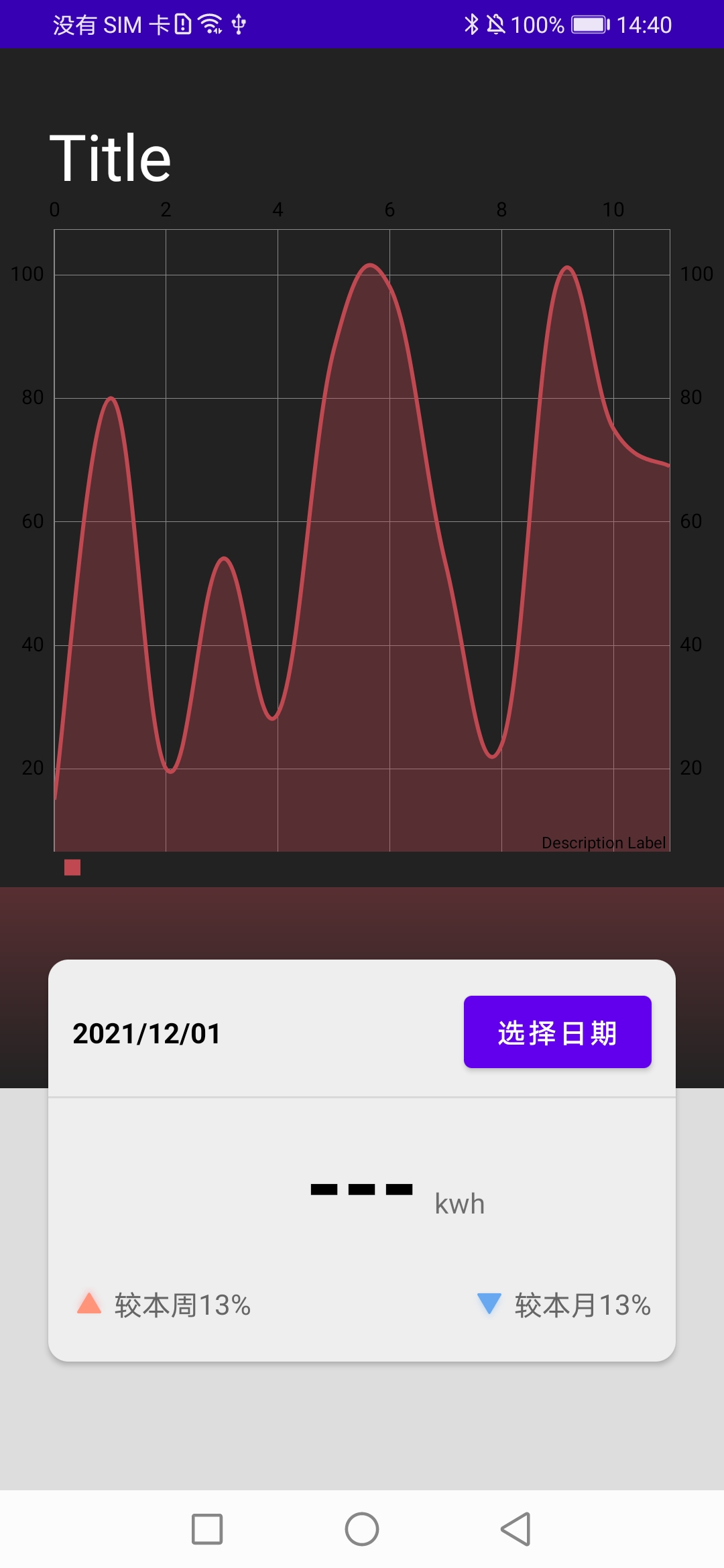
完全使用默认的配置进行展示,
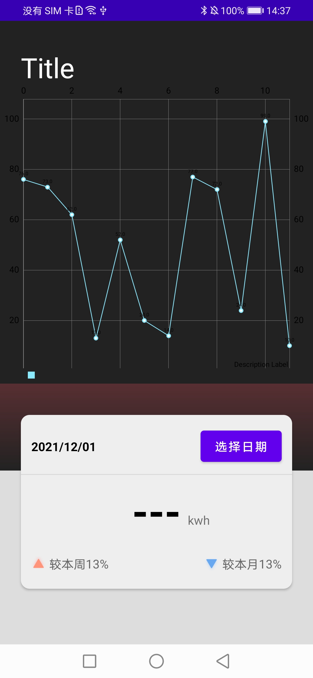
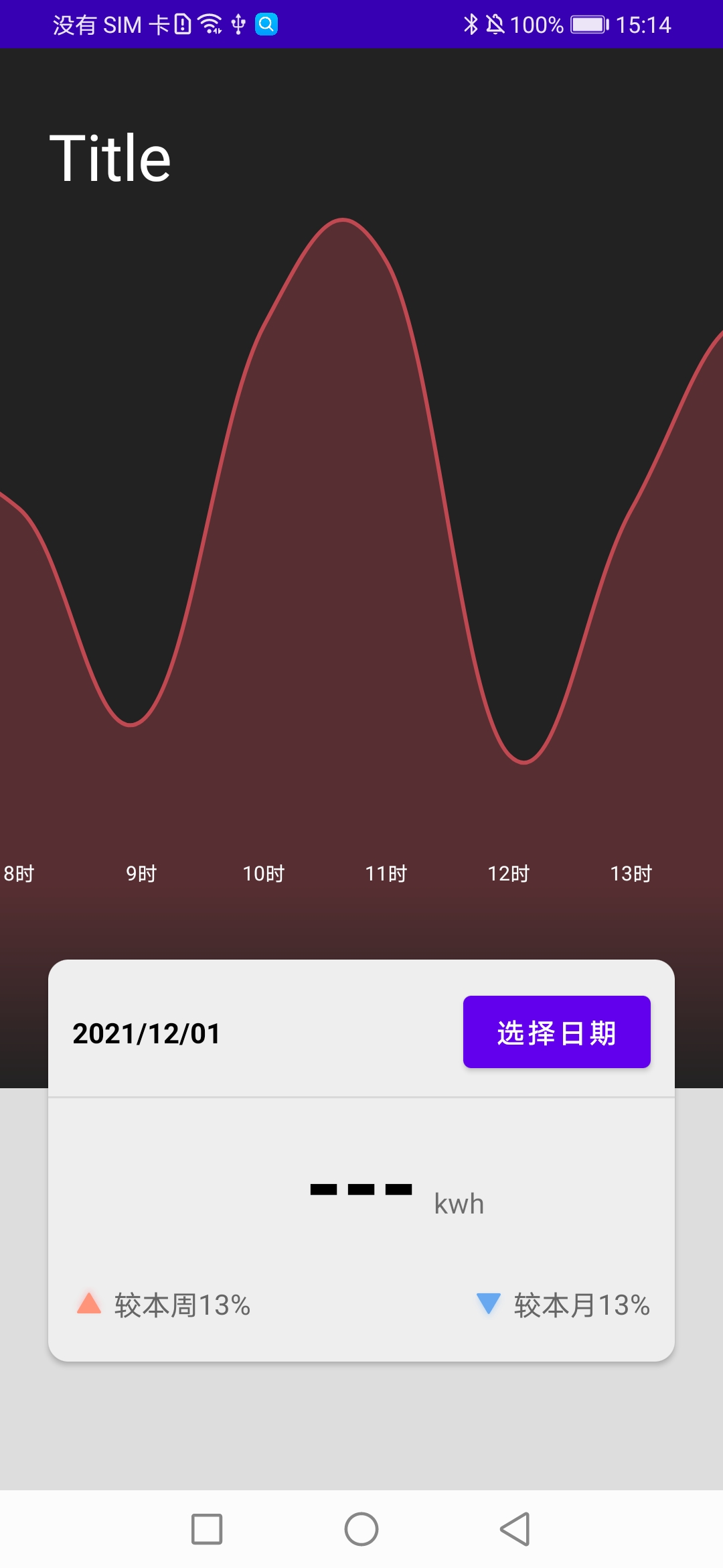
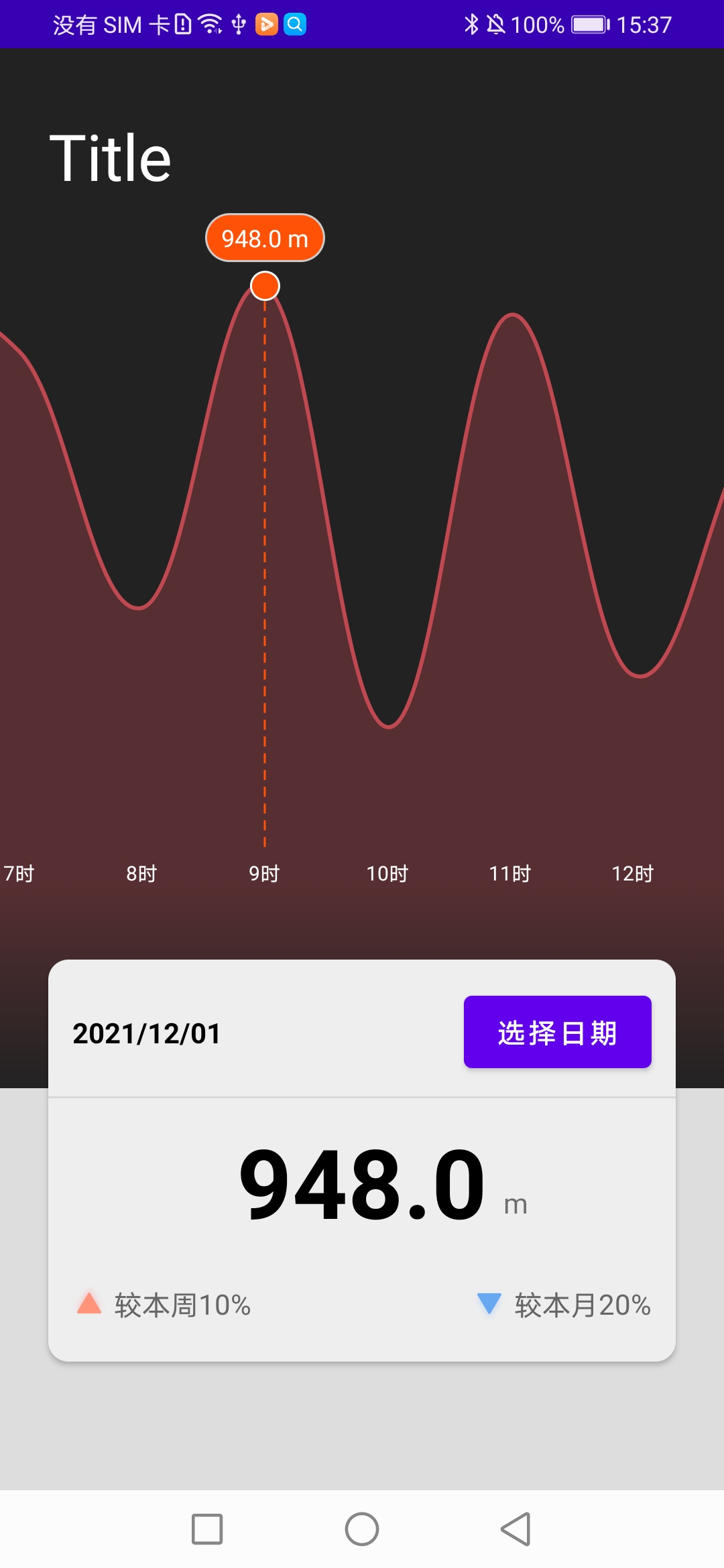
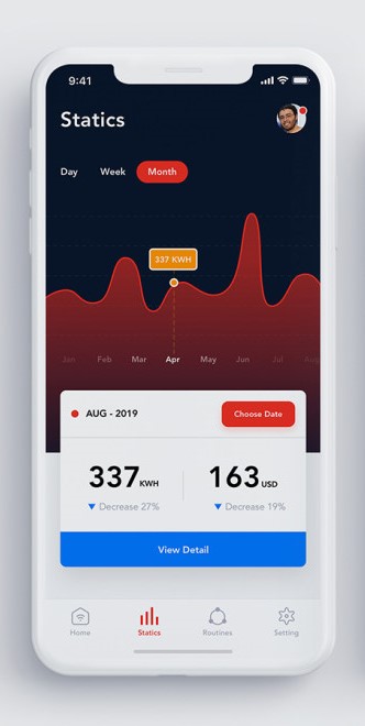
默认效果 折线优化 四周优化 覆盖物优化 UI设计:源链接

可以看到相比于完全没有优化, 效果差的不是一点点

优化思路

这里主要是ui优化, 除开整体元素设计来说, 页面风格适配就可以了. 不过我们可以将ui优化分为以下几个方向

上下

这里需要一个下方的过渡效果即可

左右

看起来没有需要优化的部分

中

我们的折线图本体, 也是我们优化的重点

四周优化

就如在优化思路中所说, ui优化需要适配这个页面的风格, 这里的四周(尤其是底部), 都是服务与想要表达的主体(折线图的), 实现起来页相对荣幸, 不需要考虑重叠动态计算相关位置的问题, 使用一个合适渐变就可以了.

折线图优化

接下来是我们优化的重点部分, 也是我们页面信息显示的主题, 折线图.

Y轴

从效果看来, Y轴对我们来说是一个多余的元素, 我们将其移除即可, 不过为了整体的效果, 还是需要进行一个相关的设置.

1
2
3
4
5
6
7
8
YAxis yAxis = binding.lcReportInfo.getAxisLeft();
//控制y轴最大最小范围, 避免因为使用了曲线而导致的折线截断
yAxis.setAxisMinimum(-100);
yAxis.setAxisMaximum(1100);

//关闭两侧y轴显示
binding.lcReportInfo.getAxisRight().setEnabled(false);
yAxis.setEnabled(false);

X轴

X轴还是有许多工作需要进行的

1
2
3
4
5
6
7
8
9
10
11
12
13
14
15
16
17
18
19
20
21
22
23
24
25
26
27
28
29
XAxis xAxis = binding.lcReportInfo.getXAxis();
//将x轴置于底部
xAxis.setPosition(XAxis.XAxisPosition.BOTTOM_INSIDE);

//两侧设置留空效果, 具体数值可以根据实际调整
xAxis.setAxisMinimum(-0.3f);
xAxis.setAxisMaximum(entries.size() - 0.7f);


//x轴文件显示颜色
xAxis.setTextColor(Color.WHITE);
//关闭网络线
xAxis.setDrawGridLines(false);
//关闭延x轴线
xAxis.setDrawAxisLine(false);

//可选, 是否控制x轴间隔数量
xAxis.setGranularityEnabled(true);
xAxis.setGranularity(1);


List<String> xAxisValues = new ArrayList<>();
//自定义x轴显示样式
for (Entry entry: entries){
xAxisValues.add(Math.round(entry.getX()) + "时");
}

xAxis.setValueFormatter(new IndexAxisValueFormatter(xAxisValues));

折线

除此之外我们还需要一个和整体风格匹配的折线效果

1
2
3
4
5
6
7
8
9
10
11
12
13
14
15
16
17
18
19
20
21
22
23
24
25
26
//设置一条折线信息
LineDataSet dataSet = new LineDataSet(entries, "");

//设置折线下部阴影是否填充
dataSet.setDrawFilled(true);
//设置折现填充的颜色(透明度为0x85/0x255 在33左右)
//详情原因可以查看{@link LineRadarDataSet#mFillAlpha 参数相关定义}
dataSet.setFillColor(Color.parseColor("#c04851"));
//设置折现的颜色
dataSet.setColor(Color.parseColor("#c04851"));
//折线的宽度
dataSet.setLineWidth(2);
//设置折线模式为圆滑的曲线
dataSet.setMode(LineDataSet.Mode.CUBIC_BEZIER);
//是否绘制
dataSet.setDrawValues(false);
//是否绘制折线的点(下面会手动添加)
dataSet.setDrawCircles(false);
//是否绘制高亮效果
dataSet.setDrawHighlightIndicators(false);


//设置折线信息, 一个折线图中可以包含多个折线, 这么只添加了一条折线
LineData lineData = new LineData();
lineData.addDataSet(dataSet);

折线图通用设置

1
2
3
4
5
6
7
8
9
10
11
12
13
14
15
16
17
18
19
20
21
22
23
24
25
26
27
28
29
30
31
32
33
34
35
36
37
38
39
40
41
42
43
44
45
46
47
48
49
50
51
52
53
54
55
56
57
        //设置折线图显示的数据
binding.lcReportInfo.setData(lineData);
//不可手动缩放
binding.lcReportInfo.setDragDecelerationEnabled(true);

Matrix matrix = new Matrix();
//图标缩放显示, 使得一次最多显示6个数据
matrix.postScale(entries.size() / 6f, 1f);
binding.lcReportInfo.getViewPortHandler().refresh(matrix, binding.lcReportInfo, false);

//设置四周边界位移
binding.lcReportInfo.setMinOffset(0);

//设置空描述
binding.lcReportInfo.setDescription(null);
//关闭缩放
binding.lcReportInfo.setScaleEnabled(false);


//设置图例不显示
Legend legend = binding.lcReportInfo.getLegend();
legend.setEnabled(false);

// //创建覆盖物并选择中心位置数据高亮
if (entries.size() != 0) {
createMakerView();
//此操作需要晚于setData(), 否则会导致空指针异常
binding.lcReportInfo.highlightValue(getChartMiddle(), 0);
updateBottomInfo(entries.get(getChartMiddle()).getY());
}

//设置滑动监听
binding.lcReportInfo.setOnChartGestureListener(onChartGestureListener);


//监听选中
binding.lcReportInfo.setOnChartValueSelectedListener(new OnChartValueSelectedListener() {
@Override
public void onValueSelected(Entry e, Highlight h) {
//查看覆盖物是否被回收
if (binding.lcReportInfo.isMarkerAllNull()) {
//重新绑定覆盖物
createMakerView();
//并且手动高亮覆盖物
binding.lcReportInfo.highlightValue(h);
}
updateBottomInfo(e.getY());
}

@Override
public void onNothingSelected() {

}
});


binding.lcReportInfo.invalidate(); // refresh

覆盖物

我们可以看到, 默认的覆盖物效果和我们整体的风格十分不搭, 所以我们还需要进行覆盖物的设置, 不过默认LineChart只能设置一个覆盖物, 所以我们需要重新实现LineChart

            //在对应点上添加选择信息覆盖物
            reportInfoMarkerView.refreshContent(e, highlight);
            reportInfoMarkerView.draw(canvas, pos[0], pos[1] - reportInfoMarkerView.getHeight() / 2);

            //在对挺点位置条件选择点覆盖物
            reportPointMarkerView.refreshContent(e, highlight);
            reportPointMarkerView.draw(canvas, pos[0], pos[1] + reportPointMarkerView.getHeight() / 2);

            //判断是否可以绘制虚线
            if (this.getHeight() - 50 > pos[1] + reportPointMarkerView.getHeight() / 2) {

                //通过canvas绘制虚线
                Paint mPaint = new Paint(Paint.ANTI_ALIAS_FLAG);
                mPaint.setColor(this.getContext().getColor(R.color.color_orange));
                mPaint.setStyle(Paint.Style.STROKE);
                mPaint.setStrokeWidth(3);
                mPaint.setPathEffect(new DashPathEffect(new float[]{15, 10}, 0));

                Path mPath = new Path();
                mPath.reset();
                mPath.moveTo(pos[0], pos[1] + reportPointMarkerView.getHeight() / 2);
                mPath.lineTo(pos[0], this.getHeight() - 50);
                canvas.drawPath(mPath, mPaint);
            }

后记

最后我们就可以看到一个显示效果不错的折线图了, 当然其中还有许多可以优化的部分.

相关代码, 我的GitHub: https://github.com/clwater/MPAndroid_LineChart